


Timeouts are lightning-quick interviews. Five questions to help you get to know the players holding court at Dribbble. Many thanks to Dana for being today’s interviewee.
Who are you? Let us know where you hail from and what you do.
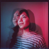 My name is Dana Tanamachi and I’m a graphic designer and custom chalk letterer who hails from the Lone Star State, but currently resides in Brooklyn, New York. I spend my days working at Louise Fili Ltd with my talented co-worker and cohort, John Passafiume. After hours, I moonlight as a chalk letterer, creating large-scale chalk installations in New York City. I also apply my chalk lettering to a wide variety of uses for publications, packaging, apparel, etc…
What are you working on?
Right now, I’m having fun working on the second out of four wine labels for Nagging Doubt wines. I’m also currently working on a couple of shirt designs for Adidas.
Choose a favorite shot of yours. Tell us why it’s a favorite.
I’ll choose my Specials of the Month shot which was a section opener for EveryDay with Rachael Ray magazine.
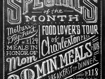
I guess it’s my favorite since it was the first published piece that my Grandma in Texas could go buy at her local grocery store!
Tell us about your setup. What tools did you use to create the shot(s)?
My setup is pretty simple, really. When I’m not doing an installation on-location, I just work from home. I’m always sketching on tracing paper with plain old #2 pencils—nothing too fancy there.
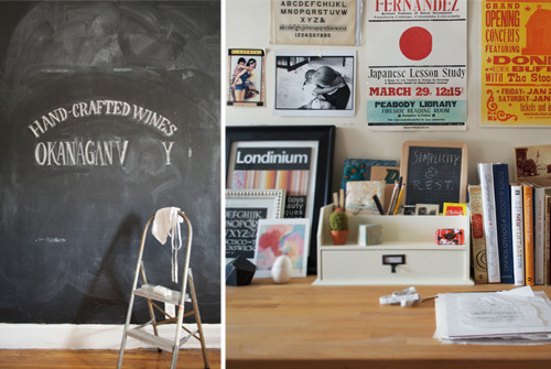
Other than that, I use white chalk from the dollar store, old rags, a step stool, and a flexible sewing tape measure. I have a large chalk wall at home that I typically draw on, though I often use large masonite boards for projects that require colored chalkboard paint. Or if I have more than one job going on at a time.
Choose a favorite shot from another Player. Why do you dig it?
My favorite shot is Simon Walker's Gold Top Bottle Comps.
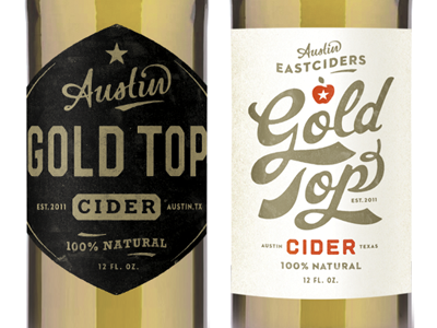
Truth be told, I am a huge fan of Simon’s work (and not just because he’s a fellow Texan!). His type work is always spot on—simple lines and shapes; well-balanced with little surprises if you look close enough. His work stands out among all of the mid-century textured stuff that is out there because of its economy. I love this shot of the two bottles because the design is beautiful and it’s also a photo of an actual, tangible product. It shows two labels that are quite different in color and type style, but that still work so well as individual options
Find more Interviews stories on our blog Courtside. Have a suggestion? Contact stories@dribbble.com.


