


Timeouts are lightning-quick interviews. Five questions to help you get to know the players holding court at Dribbble. Many thanks to Alex for being today’s interviewee.
Who are you? Let us know where you hail from and what you do.
 My name is Alex Rinker. I’m originally from Ketchum/Sun Valley, Idaho but have been living and working in Southern California the last 12 years. Currently I am working at Ted Perez + Associates in Venice, CA as Art Director / Designer / Illustrator. I’m also one of the dudes behind www.generalssurplus.com & www.ascottee.com.
What are you working on?
Currently in the works that I can talk about… Putting the finishing touches on new goods for The General’s Surplus that will be launching very soon! A full blown redesign of my personal site and organizing 10 years of work for that (It’s been 5+ since the last update—yes I know that’s lame)
Currently in the works that I have to keep somewhat vague… Destroying major U.S. cities (via Photoshop) to look post-apocalyptic for a certain video game media campaign, as well as a Logo / Branding project codenamed “The Harbor Project”.
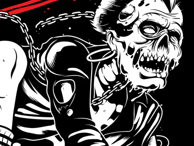
Choose a favorite shot of yours. Why is it a favorite?
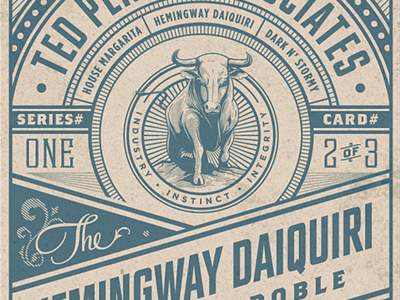
My favorite shot is the Cocktail Recipe Cards I did these for the bar (The Buck Turgidson) we have here at the office, and pretty stoked how they came out. Eventually I would like to do a second set and maybe a third. Who knows maybe get them all letterpressed and sell as a set—depends on if people would be interested in buying them or not.
Tell us about your setup. What tools did you use to create the shot(s)? (e.g. hardware, software, pens, paper, blowtorch, etc.)
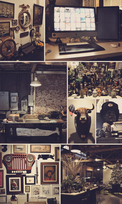
My setup is pretty standard: AI, PS, pen, paper, wacom, imac, chair, brain. The office itself is a little more interesting… All sorts of artifacts, taxidermy, vintage goods, busts, and art surround the space.
Choose a favorite shot from another Player. Why do you dig it?
Like everyone else, it is very hard to choose one. Here’s a couple that have stood out recently and why I dig em.
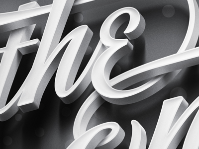
This shot has all sorts of amazing going on. First off I love classic “The End” screens from old movies, then through in an Ale Paul typeface w/ interlocking ligatures, blow it out three dimensionally, add a lil film grain and POW!
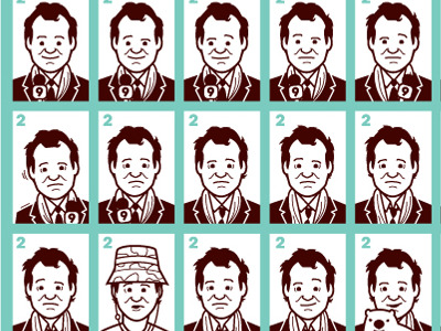
Carl Spackler!
Jim Phillips was one of my favorite artists growing up. I had a multiple Santa Cruz skate decks and had his stickers on everything. Matthew's work/style reminds me of Jim Phillips' work and I dig that.
Find more Interviews stories on our blog Courtside. Have a suggestion? Contact stories@dribbble.com.


