Timeouts are lightning-quick interviews. Five questions to help you get to know the players holding court at Dribbble. Many thanks to Claire for being today’s interviewee.
Who are you? Let us know where you hail from and what you do.
![]() I’m a graphic designer and typographer working with my partner via our small design studio, Op45. I’m originally from France (although I’ve never really lived there) and currently living in Prague, Czech Republic.
I’m a graphic designer and typographer working with my partner via our small design studio, Op45. I’m originally from France (although I’ve never really lived there) and currently living in Prague, Czech Republic.
What are you working on?
The last couple of weeks have probably been my busiest ever, so I’m doing quite a few things. I’m mostly working on custom logo-types as well as some branding development for a few logos I’ve previously designed. There are also few projects launching soon that I haven’t been able to talk about yet, so looking forward to showing those. Personal work has been a little limited lately, although I do finally have a new idea for a typeface (potentially) so I hope to find more time to dedicate to that, too.
Choose a favorite shot of yours. Why is it a favorite?
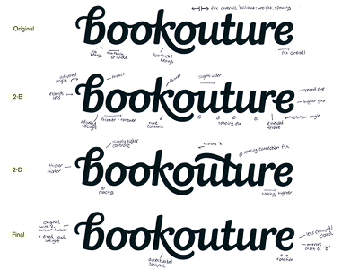
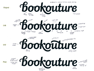
It’s a plain, black & white scan and not visually the most exciting image, but this logo process shot really represents the step that I’m most careful with, as it’s so final and it’s awful realising you’ve missed something when it’s all sent off. I also received so much fantastic feedback and suggestions for this particular project, which was so helpful in terms of the overall process.
Tell us about your setup. What tools did you use to create the shot(s)? (e.g. hardware, software, pens, paper, blowtorch, etc.)
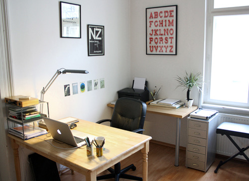
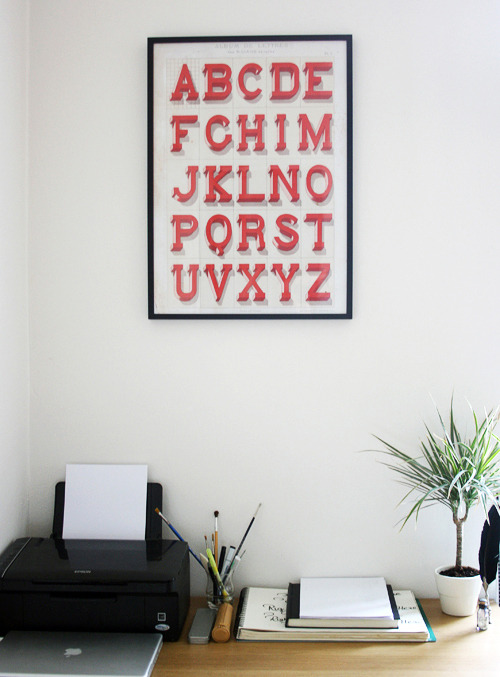
For lettering projects, I work a lot on paper (either sketchbooks or cheap printer paper), typically exploring initial ideas using different pens to get the (very) rough drafts. I don’t really have a favourite brand or type of pen, just whatever makes different strokes. Sometimes I scan these to fix them up a bit or to combine elements from different versions, then either use my old laptop screen as a makeshift lightbox, or just simply draw over in pencil. For vectoring, I use mostly the standard pen tool in Illustrator CS3 but occasionally switch over to FontLab Studio. I also spend a lot of time in InDesign for collateral materials, posters, etc. and Fireworks for any web layout work.
Choose a favorite shot from another Player. Why do you dig it?
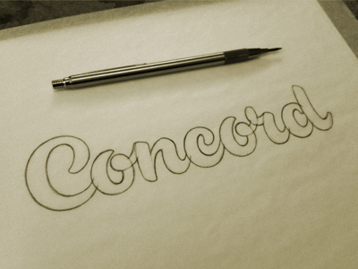
This was a difficult choice, but one of my all time favourites is ‘Concord Sketch' by Jeffrey Devey. There’s something about his script lettering pieces in particular that get me every time. I come back to this one regularly, it’s so beautifully drawn with such perfectly considered shapes and curves. I really love the quietly confident style too – it’s distinctive and unique without shouting for attention.
Find more Interviews stories on our blog Courtside. Have a suggestion? Contact stories@dribbble.com.


