


Timeouts are lightning-quick interviews. Five questions to help you get to know the players holding court at Dribbble. Many thanks to Drew for being today’s interviewee.
Who are you? Let us know where you hail from and what you do.

What are you working on?
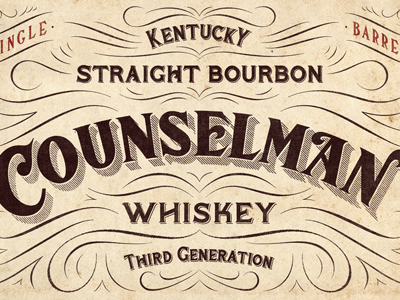
Right now I do about 2 shirts a week at Sevenly plus some side projects. My favorite side project is a label for a brand new whiskey. The brand is called Counselman Whiskey. It’s an old family recipe that they are starting to sell to stores. They are so much fun to work with and it’s great to be able to have so much input in the very early stages like this.
Choose a favorite shot of yours. Why is it a favorite?
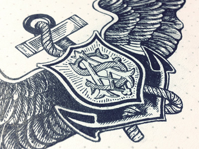
My favorite is the Salvation Army Crest that I did a few months ago. The reason I love this shot so much is because it represents a turning point in my work as I have started pursuing new paths as an illustrator and letterer. It was the “Ah-Ha!” moment for me. Up to that point I don’t think that I knew I could actually execute to that level of detail or precision—it was also the first design that I didn’t do some sort of vectorization to and that was hard for me because I like to tweak everything to a point of “dehumanizing” things sometimes. The final piece turned out just beautiful.
Tell us about your setup. What tools did you use to create the shot(s)? (e.g. hardware, software, pens, paper, blowtorch, etc.)
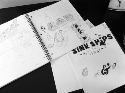
95% of the time I am just using a 2b pencil and either a Dot Grid notebook or tracing paper. I use a lot of marker paper for final drawings. When I ink up a final piece I use Microns or Copic pens. When it’s time to finish up the piece I use the freebie scanner I received when I bought my 27” iMac. I mostly use Photoshop and Illustrator (version 5.5) and then I send it away for production.

Choose a favorite shot from another Player. Why do you dig it?
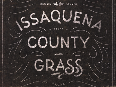
“Issaquena" by Simon Walker. When I first saw this post in my feed I swear my jaw hit the floor. I was blown away by the elegance of this piece. It doesn’t feel over complicated or too self-indulgent. It feels just right.
Find more Interviews stories on our blog Courtside. Have a suggestion? Contact stories@dribbble.com.


