


Seizing St. Patrick’s Day as a green-and-gold opportunity, we’ll be profiling a few Irish and Ireland-based Dribbblers over the next week.

Fourteen days.
Dublin had fourteen days to woo Steve Simpson, and Dublin won his heart. The Manchester, England-born designer came to the city in 1990 for a two-week storyboarding gig. The country was coming off a bleak decade, but things were starting to look up.
“Ireland was just starting to emerge from the recession. … Pretty much everybody I met outside the studio was Irish,” Simpson recalled. “Emigration was high and immigration unusual. Being British, I wasn’t sure what sort of welcome I was going to get; tensions were still high in North Ireland.”
The welcome Simpson got was … welcoming. “Extremely welcoming,” he said. “So much so that after the two weeks was up I couldn’t leave and have been here pretty much ever since.”
Back in those early days, Simpson’s favorite haunt was Temple Bar, a tourist-friendly, culture-thick, pub-filled area that’s preserved its medieval street pattern. In 1990, the neighborhood was fresh off a supporting role in the Kidman-Cruise melodrama Far and Away.
“Bits of the set were still evident along cobbled streets,” Simpson remembers. “It really felt like stepping back in time. The local, also named the Temple Bar, held no more than 40 people with a real fire, rickety staircase, and great Guinness.”
Simpson’s since become a family man and lives about 20 minutes outside of Dublin, near the coastal town of Dún Laoghaire. He’ll spend his St. Paddy’s taking in a parade with the kids. Keeping in line with our theme, he offers up a shout-out to his good friend, Irish-American Dribbbler Mike Moran, who Simpson calls “a real gent!”
For his shot spotlight, Simpson chose the book jacket for Derek Brazell and Jo Davies’ “Becoming a Successful Illustrator,” hitting bookstores in May. Like his original Dublin stint, Simpson’s book jacket project lasted two weeks, the tight deadline mitigated by creative freedom. Simpson used the book’s technical constraints — the position of the logos, white vertical band, and size of the title box — as a jumping-off point.
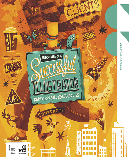
“My first thought was to make the title box into a portfolio case,” he said. “Once I’d added the handle, the hand, arm and figure fell into place quite nicely. I like the fact that we don’t see the head.”
Simpson drew a box around the AVA logo, transforming it into the top of a high-rise, allowing him to create an entire row of buildings and break into the vertical white band. He worked the chapter headings into the design, hand-drawing the text. Finally, he addressed the editor’s concerns about a distracting background by creating it in grayscale, then color overlaying the brown-orange-yellow to tone down the background action.
And he had fun. “This was a really great project to work on,” he said.
Simpson can be found online at stevesimpson.com and on Twitter @stevesimpson.
Find more Updates stories on our blog Courtside. Have a suggestion? Contact stories@dribbble.com.


