


Timeouts are lightning-quick interviews, five questions to help you get to know the players holding court at Dribbble. Thanks to Robert for being this week’s interviewee.
Who are you? Let us know where you hail from and what you do.
 I am an Australian/American designer. I grew up in Melbourne, Australia, but for the last 10 years I’ve called San Francisco my home. I recently left Apple, where I was a designer working primarily on the iLife apps for Mac and iOS for 3 years. Prior to that, I had worked with startups like Stipple, DoubleTwist, Tapulous, Cooliris, Delicious Monster, and Gaia Interactive.
Typically I work on both visual and interactive components of software. I also do more traditional graphic design, such as identity work.
What are you working on?
Right now I run my own one-person design studio. Companies work with me to do anything from design strategy, identity design, as well as software design. I’m also collaborating with other designers on projects, which is very exciting. Currently I’m running a Kickstarter project for my minimalist Atelier Playing Cards, which has been incredibly successful so far.
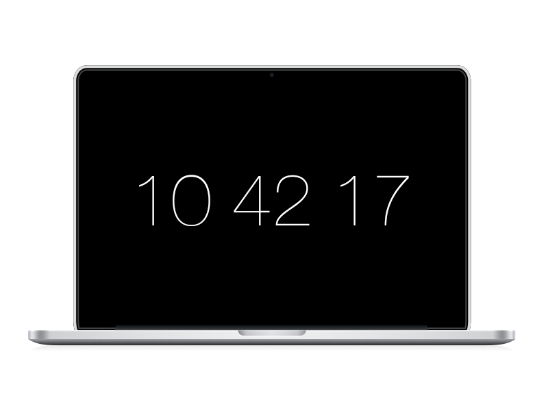
Choose a favorite shot of yours. Why is it a favorite?

My favorite shot is the Padbury Clock Screen Saver which marks the end of an almost two-year absence from Dribbble. I love this shot for many reasons. The biggest one is that its simplicity absolutely betrays the complex process of creating it.
I spent weeks obsessing over the typography and the different information I could include (at one point it included the day and date). When I finally had decided to use Helvetica Neue Ultralight, I didn’t like using the colon character as the time separator. I tried many different options until I finally decided to drop it all together. The result is just large, beautiful numbers.
Even for the accompanying website, I pushed myself to create a website that was as simple as the screensaver. There’s so much temptation to put share links, hashtags, icons, and all sorts of things on a webpage. It was incredibly difficult to just say “no,” and have the screensaver illustrated, and the text to download.
Although most people know me for my work on textures, 3D, and rendered objects, my original design style was geometric, rationalist, and minimalist. My “R” logo that I use as my avatar [see above] is a great example of this.
Tell us about your setup. What tools did you use to create the shot (e.g. hardware, software, pens, paper, blowtorch)?
The original screensaver was made with Quartz Composer. For the final shot, I created the computer and representation of the screensaver in Photoshop. Normally my tools and setup are a bit different. For sketching and idea creation, I use a Mont Blanc mechanical pencil and a Fabriano dotted grid A4 notepad. I also keep Field Notes notebooks on me at all times. Digitally, I’m on a 15” MacBook Pro with Retina Display with a Magic Mouse. I typically work in Photoshop, Illustrator, After Effects, and Keynote. I also use some specialized software like Icon Slate, and Slicy for production.
Choose a favorite shot from another Player. Why do you dig it?

Motion Icon by Brian Frick. Brian’s work is incredible, and this icon is one of my favorites of all time. The concept is genius and the execution is sublime. His work, including this icon, inspired me to become an icon designer. Although this style is going out of fashion, I think this one in particular represents the highest form of artistry in icons.
Find Robert at Dribbble, on Twitter, and at www.padbury.me.
Find more Interviews stories on our blog Courtside. Have a suggestion? Contact stories@dribbble.com.


