After five years of looking at the same logo each and every day, you start to notice things. Things that begin to gnaw at you, keep you awake at night, sweating, silently scream—no wait that’s someting else. But there were many things that bothered me about the original Dribbble script.
A Little History
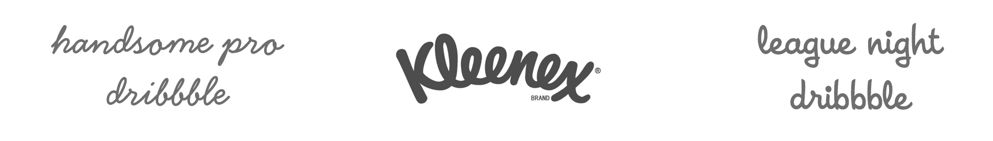
I can honestly and unabashedly say that the biggest inspiration for the script style was the Kleenex logo. All those perfectly looping e’s! And that l! And Dribbble has three b’s, an l, and an e! So, after a cursory amount of type research, I set out to create a hybrid of two typefaces mixed together: Handsome Pro Bold by Nick Shinn and League Night from House Industries’ House-a-rama family. Certain letters from each font were mashed together, then significantly tweaked and skewed to stand the word upright.
The result worked, and I was happy enough with the mark for the tiny side project that Rich and I began building. As time goes on, and as a brand grows, logos are inevitably used in situations you might not expect them to be. A great logo designer knows this. I am not a great logo designer. Eventually, the imperfections and inconsistencies really stand out—particularly at large sizes: Jagged transitions between letters, varying line thickness (e.g. the ‘le’ was significantly thicker than the rest of the letters and once you see it, it’s impossible to unsee), uneven baseline, etc.
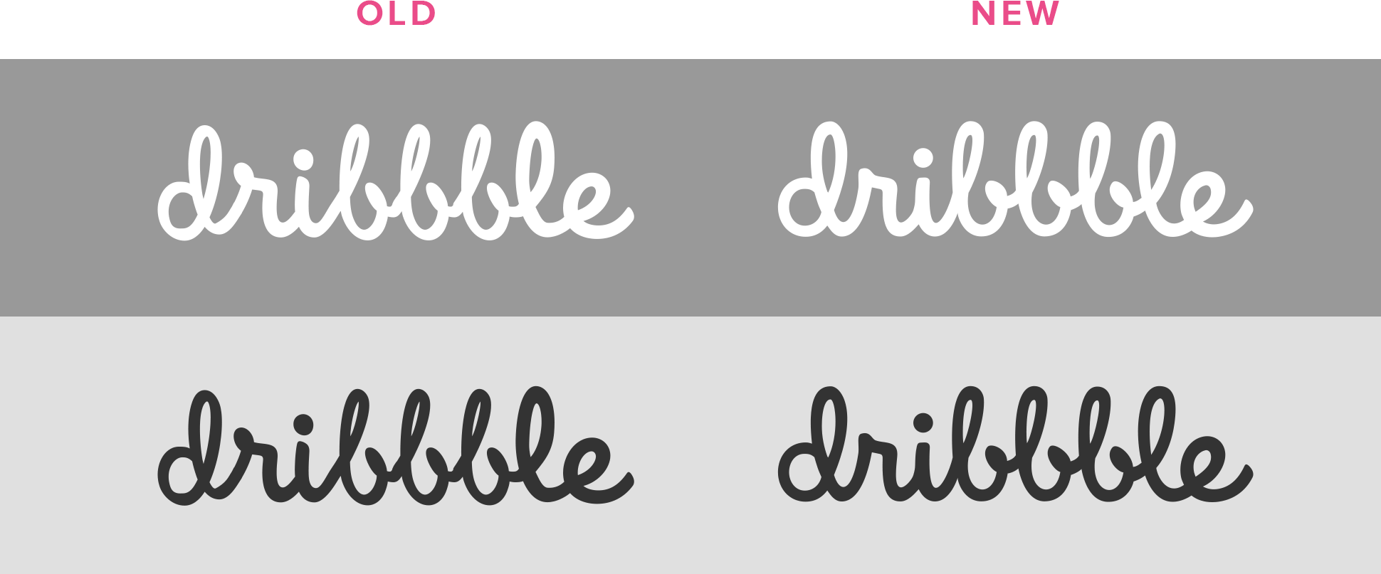
A few weeks ago, I finally spent some quality time with my friends, the Beziers (of which I have a much better grasp now than I did 5+ years ago). I reviewed every curve, smoothing things out, making the line weight consistent throughout, giving the baseline and x-height a more even plane, widening the counters in order to make it clearer at smaller sizes—basically fixing everything that’s been bugging me about the mark for the last several years.
“The nice thing about refining as opposed to redesigning is that the old and new can easily coexist.”
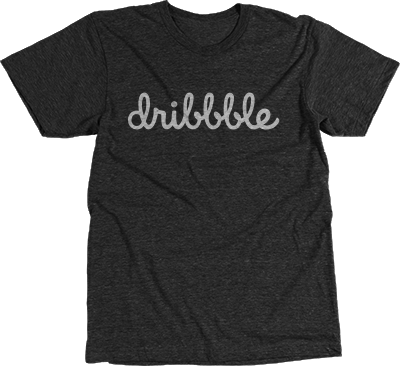
At small sizes, few will even notice the change, but it feels good having a more refined version in place now, knowing that’ll it hold up to whatever it needs to going forward. Also, the nice thing about refining as opposed to redesigning is that the old and new can easily coexist (temporarily of course). We’ve rolled it out here and on the website, and eventually it’ll make it’s way to all the physical products as they’re restocked. That said, get your limited-edition, vintage logo merch now while it lasts (use code BEZIER at checkout for 15% off your orders through 11/30).
Find more Updates stories on our blog Courtside. Have a suggestion? Contact stories@dribbble.com.


