


L-R: Independence Brewing's Power and Light Ale by Jose Canales, Fort George Brewery's Fresh IPA by The Little Friends of Printmaking, Cuthroat Pale Ale and Hop Notch IPA from Uinta's Classic Line by Josh Emrich
The Designer Checklist: Beards. Sweater Vests. Bicycles. Ampersands. Cuffed Jeans. Brick walls. Beer.
When we sat down to plan our first-ever “Designing For,” an occasional series exploring hyper-specific design niches, we decided to embrace stereotype. If designers like beer, then designers must like designing for beer. Right? All signs point to yes. (By “all signs,” we mean a quick “beer” search at Dribbble.)
Cylindrical tin canvasses present multiple design challenges. To get a better handle on the particulars, we interviewed Jose Canales, Josh Emrich, and JW and Melissa Buchanan, AKA The Little Friends of Printmaking. Jose and JW talk about process on specific projects below. On Wednesday, Josh will show you his cans.
The Challenges
- The can is a can and a can is not big. Also, many craft brewers are not big, and cannot afford big advertising campaigns. The beer can may well be the consumer’s first view of the brewery. “The packaging has to do a lot of work,” Josh says. “You only have 3.5” x 4.25” of visible space to make people fall in love with that brand for the first time.” Furthermore, nearly a quarter of that already-slight space must be reserved for government-required labeling. And the beer can’s shoulder must remain unprinted.
- The can is a can and a can is not flat. The person holding the beer can only sees about a fourth of the design at a time. “That means that each 25 percent slice of the design has to hold up on its own and be somewhat comprehensible,” explains JW.
- Can colors are limited to six. Just six. Only six.
- Can ink is messy. The ink used on cans is runny and the process requires wet-on-wet printing. Furthermore, says Jose, “trapping is typically more than you would like, so detailed artwork can get muddy.”
The Cans
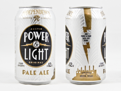
Independence Brewing Co.’s Power and Light Ale
Austin-based brewery Independence hired Austin-based designer and illustrator Jose Canales to overhaul its 10-year-old brand. Jose was tasked with creating a strong but subtle identity that didn’t overpower the brewery’s distinct brews. “Each can has its own personality, so the first challenge was to find a way for the brewery branding to work across all beers and be secondary to each beer’s personality,” he said.
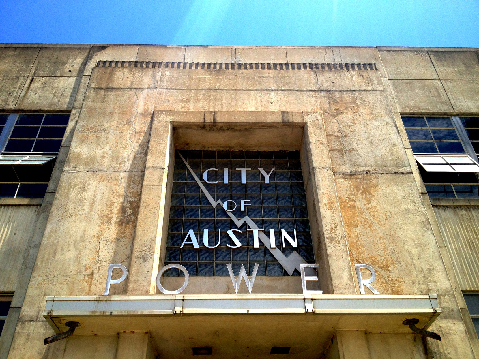
Brainstorming for crisp and hoppy Power and Light Pale Ale, the brewers and Jose looked to Austin’s historic Art Deco Seaholm Power Plant.
“Using this as the inspiration, there was opportunity to use the substrate of the can for that sleek, industrial, deco feel,” Jose said. “The bold, black circle helps serve as a centerpiece and establishes hierarchy. On the side sits a profile of the Seaholm plant paired with a lightning bolt and playful taste description.” Finally, Jose used a semi-transparent gray over the aluminum to tone down the sheen.
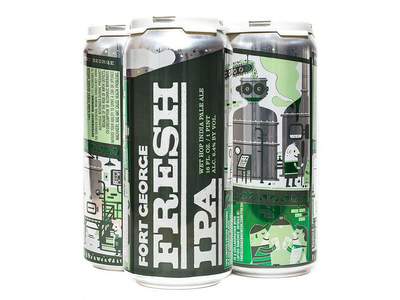
Fort George Brewery’s Fresh IPA
Jose is an old can hand, but JW and Melissa Buchanan, AKA The Little Friends of Printmaking, came new to the process for Fort George’s Fresh IPA, one of the Oregon brewery’s seasonal brews. The LA-based husband-and-wife team has focused on art prints for much of their 11-year partnership, making recent forays into commercial illustration and design. The beer can remained, until Fort George, a mystery.
The design process began with Josh Berger, JW and Melissa’s art director on the project. Josh envisioned a canny riff on Milton Glaser’s iconic Bob Dylan poster, replete with blobs and clouds. Drawn flat, the concept translated. Wrapped around a can, not so much. “It was hard to understand exactly what you were looking at until you spun the can around a few times,” JW told Dribbble.
Glaser scrapped, JW and Melissa decided to embrace their medium. “No matter which of our design concepts got approved, Melissa and I wanted to be able to use the shiny, bare aluminum of the can in our design somehow.” And so, six colors became seven.
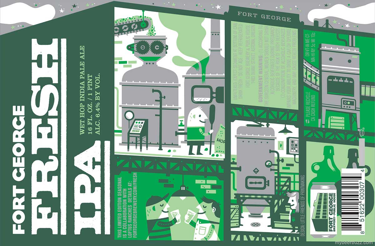
The duo came up with a wrap-around brewery concept. Brew tanks and machinery offered perfect means of using the metal in the design. “We even made the sky bare aluminum, so we could cheat our design right up to the edge of the printable area next to the can’s shoulder.” When they learned they couldn’t overlap ink colors, they pulled text and logos into the illustration.
The process required massive puzzle solving on the part of JW and Melissa, with twin goals of maximizing illustration space and including all required content. “We cut some illustrated elements and reconfigured some others, trying to buy ourselves as much real estate as possible,” JW said. “Dealing with the limitations of the printing process and the small-bore adjustments to the type were the real strenuous, heavy-lifting parts of the job.”
The effort paid off. “When we got our prototypes … in the mail, it felt like a victory. We had fought the limitations of the medium and won.”
Want more? Get canned again next Wednesday, when Josh Emrich talks about his process designing beer cans for Grimm Brothers Brewhouse and Uinta Brewing.
Find Jose at Dribbble, on Twitter, and at josecanales.com.
Find JW and Melissa at Dribbble, on Twitter, and at thelittlefriendsofprintmaking.com.
Find more Process stories on our blog Courtside. Have a suggestion? Contact stories@dribbble.com.


