


MISSION: PLACEIST.COM
Encourage users to travel to amazing places. Entice with beautiful images; further lure in with gaming aspects. Allow users to track journeys and share experiences with other users, thereby growing community and increasing likelihood that future users will travel to same amazing places.
UX AGENT: JAN LOSERT
Born in Prague, interface designer Jan Losert now lives in London. He loves seeing how people think, he loves complex dashboards, he loves making people’s jobs easier, and he loves saving them time. Recent past missions include a redesign of Tapdaq, an advertising network for indie app developers, and Spacyy, an iOS space game created with Lukáš Kus. For this mission, Losert teamed up with developers Jakub Kontra and Honza Štěpanovský.
TOOLS
Adobe Photoshop, Invision for testing interactions, Shutterstock and Flickr for pictures
ATTEMPT 1
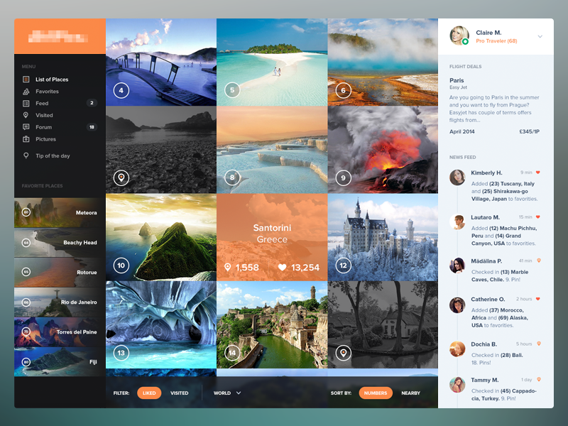
Initially, Jan adapted a “cool” dashboard layout for Placeist, including the home page (above), but quickly realized the pages were too busy. “So many things going on,” he said. “Notifications on the right side, menu on the left with pins. So many things.”
Jan honed in on the site’s central concept — places — and imagined himself a user. “I want to see places, then possibly filter them, and then view details of a particular place. Everything else is secondary.”
Goodbye, busy busy.
ATTEMPT 2
After studying Medium’s layout, Jan chopped and redesigned. He hid notifications in the menu, which appears when the user hits the logo. He got rid of pinning (favoriting was already an option). As for the places, “you have a full-width image, then a gallery with additional photos. Always nine pictures.” Main actions come before the fold, and everything else is on one scroll.
“At the end, I tried to be strictly straight to content and keep visible only the main things. The rest can be visible after, if the user wants.”
Jan went through this process with each page on the site. Below, a second set of Before-and-After shots, these for the places page for Santorini, Greece.

We encourage you to join a discussion about Jan’s work on Placeist. Head over to his After shot of Santorini and talk there. Thanks!

Find Jan at Dribbble, on Twitter, and at janlosert.com.
The UX Files is an occasional series about UX designers. Fit the bill? Email stories@dribbble.com.
Find more Process stories on our blog Courtside. Have a suggestion? Contact stories@dribbble.com.


AFTER