


Who are you?
My name is Ty Wilkins and I am a designer and illustrator in Austin, Texas.
What are you working on?
I am currently working on branding a restaurant that is located at the Menlo Park headquarters of the world’s largest social network.
Choose a favorite shot.
The icons I designed for John McGarvey, a content professional and copywriter in London, is one of my favorite recent projects. Icons are often composed of one item in a single color. With the icons for John McGarvey, I sought to challenge the conventions of iconography by depicting two or more items with each icon, introducing a more sophisticated color palette, and incorporating a geometric pattern throughout.


Tell us about your setup.
The tools I used for this project include pencil, paper, a scanner, a Mac, Adobe Illustrator and Adobe Photoshop.
Choose a favorite shot from another player.
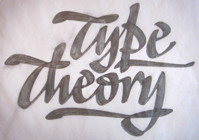
A few years ago I had the opportunity to hire Ken Barber to design the logo for Type Theory. This particular sketch exemplifies the characteristics of great lettering (color, spacing, contrast, rhythm and proportion). I particularly love the open counter of the lowercase e, the way the swash integrates with the y, the broad-edge pen inspired rhythm and the juxtaposition of smooth and angular contours.
Find Ty at Dribbble, on Twitter, and at Ty Design & Illustration.
Find more Interviews stories on our blog Courtside. Have a suggestion? Contact stories@dribbble.com.


