


“What shape says confident? What color defines smart?”
Imponderable? Yes, but also questions book illustrators face on a daily basis. Yesterday, four Dribbbling children’s book illustrators outlined some of their biggest challenges. (Pausing now so you can go read it.) Today, three of them tell you, in their own words, how they approached particular books.
The Books: Part II
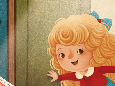
Goldilocks and the Three Bears
Illustrated by Gaia Bordicchia, published by Editions Fleurus.
“The book had two different challenges, the story and the format. When the characters are so popular and well known, there are many different versions of them and it’s difficult to find your own. In this case, the editor also wanted a realistic fur for the bears and a general vintage finish.
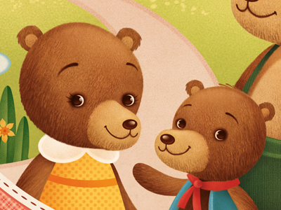
“The format included some paper engineering — two rotating disks on each page make it possible to change scene. Whenever a layout requires diecut parts, planning during roughs becomes extremely important, because some parts of the illustrations must be within a safe area. This limits the composition in many ways! Finding the right balance between all these elements was not easy at first and the early stages seemed to stretch forever, but in the end everyone was happy with the result.”
Poem-Mobiles
Illustrated by Jeremy Holmes, written by J. Patrick Lewis and Douglas Florian, published by Schwartz & Wade/Penguin Random House.
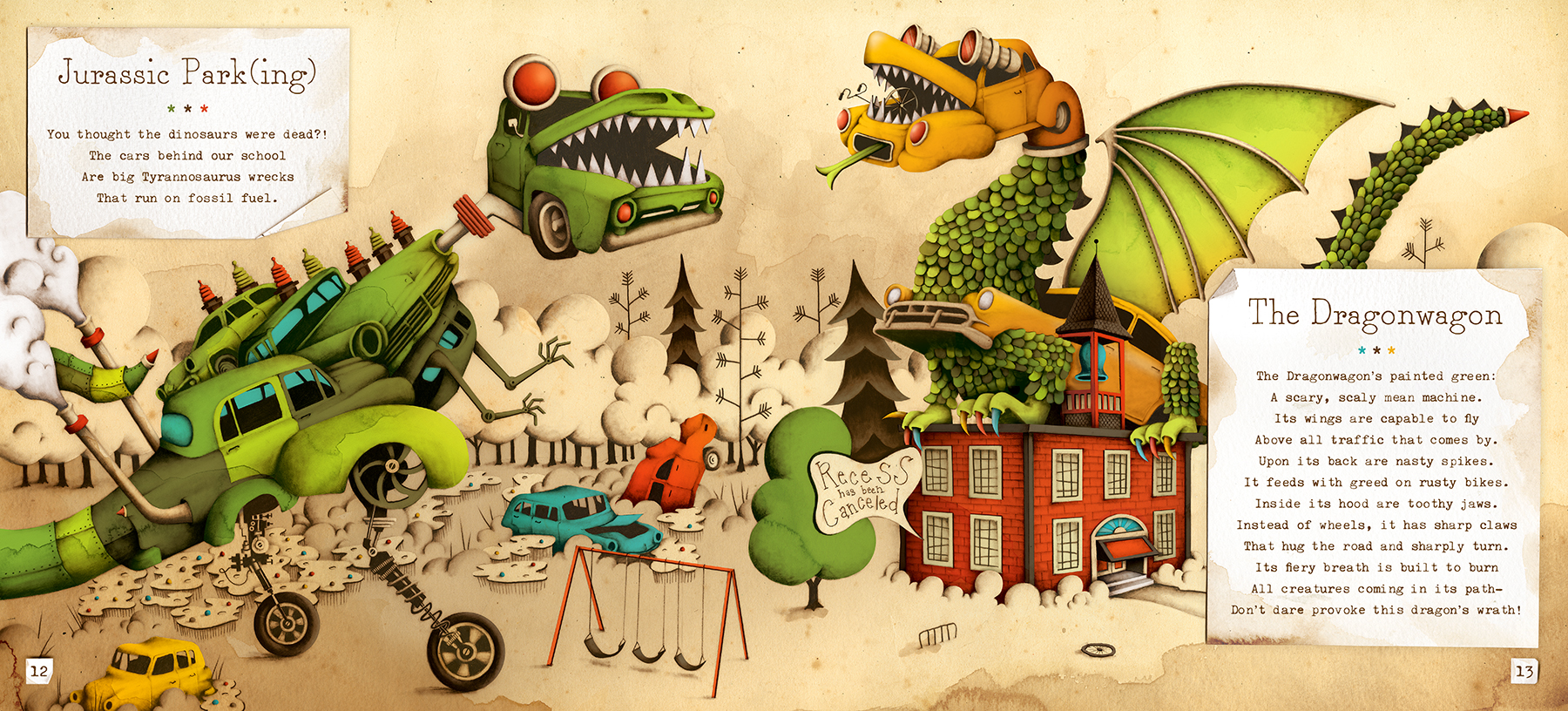
“The first step of the picture book process is to receive the script from the publisher. Once I had the Poem-mobile script in hand, I spent the next seven months sketching out the concepts for each car and the pacing for the entire book. Being a newbie to the publishing process, I was surprised when the publisher didn’t want to see anything until the entire book was worked through. I have to say, it was a bit daunting at the time, but now I actually enjoy this approach. It forces you to go with your instincts and build something only you would build.
“I was surprised when the publisher didn’t want to see anything until the entire book was worked through.”
“After the concepts were approved it was time to draw … for 18 months. It’s at this stage that I chose to venture away from an all-digital approach and create the illustrations using pencil, watercolor and vellum. Why? ‘Cause I wanted the art to have an element of imperfection. Why? ‘Cause I felt it would elevate the strangeness of the inventions which I thought would play well with the quirkiness of the poems.
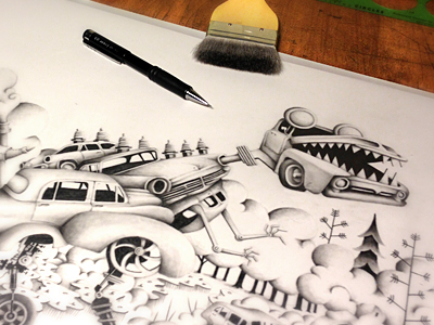
“Each pencil drawing took me about one-two weeks to complete. After I had all the drawings finished, it was time to scan and color using Photoshop. The coloring process took about three-five days per drawing. So in the end, from concept to completion, you were looking at four weeks per drawing x 21 drawings. Needless to say, I was a bit exhausted (and elated) once I put the last color down.
“I’ll end with this, having spent the past 20 years of my life in the creative industry, nothing has demanded more of my imagination and abilities than creating books for children.”
Flights & Chimes & Mysterious Times
Illustrated by Glenn Thomas/The Fox and King, written by Emma Trevayne, published by Simon & Schuster.
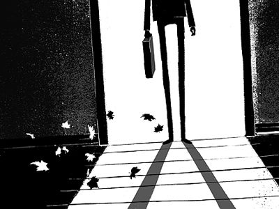
“I had already completed the cover so I had a firm grasp on the world, the story and the aesthetic I was using. However, this shot was for one of 12 interior illustrations that would appear during the chapters themselves.
“The challenge here is that unlike a cover the readers have already begun to use their own imagination to create the world. All of those inside illustrations had to be black and white, so I decided to focus on atmosphere and playing with the contrast between elements. Alluding to the scene and characters, but still allowing the reader to fill in the gaps in the darkness.”
The Accidental Afterlife of Thomas Marsden
Illustrated by Glenn Thomas/The Fox and King, written by Emma Trevayne, published by Simon & Schuster.
“This was the second cover I was lucky enough to work on with author Emma and publishers Simon & Schuster. While a completely different story than the her previous novel, The Accidental Afterlife of Thomas Marsden was very much set in a similar world with lots of steampunk gadgets and Victorian London settings. I wanted this cover to be almost a companion to the one preceding it.
“I start by reading the material and jotting down notes and ideas as I move along. I knew quite early on I wanted the cover to focus on this scene of the book and compiled several different sketches relating to this scene for the author and publisher to give feedback on. They loved this concept so we moved quickly into colour. This was one of those dream jobs where everyone’s vision was in unison and there were no battles to be won, so to say.”
Find Gaia at Dribbble, on Twitter, and at www.gaiabordicchia.com.
Find Jeremy at Dribbble, on Twitter, and at www.jeremyholmesstudio.com.
Find Glenn at Dribbble, on Twitter, and at www.thefoxandking.com.
Missed Part I? Read it! Like what you read? Check out our inaugural Design For article, Design on a Can.
Find more Process stories on our blog Courtside. Have a suggestion? Contact stories@dribbble.com.


