


Who are you?
My name is Garrett DeRossett, and I’m a designer originally from Missouri, currently residing in Austin, and relocating to NYC. I’ve been designing full-time since I was 19 across a few different specialties, from interactive to product to editorial to advertising to branding. I just left my good friends at Rocket in ATX to accept a design position at charity: water. In what little spare time I have, I take on freelance (mostly with friends) for smaller companies and musicians. Branding and print design really turn me on, but I just love to make anything I can get my hands on.
What are you working on?
My entire time here in Austin has been spent branding and designing a rad new product that the world will know about very soon. It’s got some incredibly big names attached to it, and I’m very excited for the team to get the attention they deserve later this year. On the side I have been laying low working on a personal project called Nothing Sacred. It will be a quarterly publication filled with stories and artwork from modern artists, focused on how issues like mental illness, addiction, and gender dysphoria (among many others) affect and drive their creative processes.
Choose a favorite shot.
That’s tough—I really start to hate all of my work after a certain amount of time, so I always feel like my latest shot is my favorite. However, to be totally objective I think I’d have to say this gig poster for the band Listener is my favorite. I had been beating my head against a wall for two days trying to create something that felt right, and if you’ve ever heard Dan from Listener and his music, you’ll know what I mean. When the visual pun of pitting sign language and “listening” against each other spilled into Photoshop, I knew there was something to it. Something about Listener’s work dictates a keen ear AND an open mind; I really think the idea behind the flier nailed that.

Tell us about your setup.
It’s almost offensively digital. I often will start with scribble or even a sentence that I’ve jotted down throughout the day, but other than that it tends to go straight to the computer. This particular one happened when I stumbled across some super old ASL doodles and that lightbulb went off in my brain when I compared sign language to the band name. Posters, for me, are always accidents. I click around, mix and match type and graphics, and turn on random blending modes until something looks nice. I’ve been told my methods are ridiculous and unhinged.
Choose a favorite shot from another player.
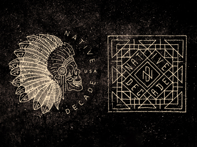
Ah! I tend to be pretty discerning about who I follow, and that generally means I always see so many lovely people with work I adore. I wish I could name ten shots. If I really had to pick, I think that I’d go with this older jam from my good friend Keith Davis Young.
“It’s at once both mathematical and messy, weird and smart.”
There’s something incredibly visceral to me about the way the textures, colors, and type all come together. It’s at once both mathematical and messy, weird and smart. In a strange era where a lot of designers seem to latch onto this “hand drawn line art” style, this shot has always proven to me that there’s a pinnacle that nobody else can quite copy.
Find Garrett at Dribbble, on Twitter, and at www.studio-victorious.com.
Find more Interviews stories on our blog Courtside. Have a suggestion? Contact stories@dribbble.com.


